this tutorial is to help some one use dynamic modal windows.
You don't need that much stuff a couple of movie clips (photos, drawing objects, or event objects with text), some patience, and about twenty minutes.
first create a button to access the modal windows, this can be anything, it just needs to be on the main time line.
Next, you need to create a movie clip for your modal. (hence mines called model_mc).
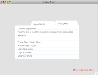
inside the Movie Clip you have your viewable content, in this case the index cards.
I've made each a movie clip, and inside the movie clip I have added a static text field or the title, and a dynamic text field for the description area, (don't forget to name your instances).
while still inside the modal_mc make a shape the size of your stage, and save it as a btn (I called mine modalBox_btn) and then give it an alpha so you can still see the main stage.
come back to the main time line, make your actions layer and add the following code.
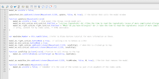
*note the green running off the stage is my content for the index cards, and isn't very important.
to add the descriptions, you made the dynamic text field in your index card movie clip, make sure you hit the HTML editable button. Then cast down from the main time line to the text field and add whatever you want.
if all went well you should have a working modal window.
good luck!
if I've confused you and would like to ask me to clarify, let me know!
thanks!
demo:
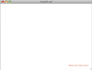
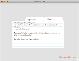
first have your main timeline, then when you click the orange button, then click allergens tab, then click off the screen and returns you to the first.

Next, you need to create a movie clip for your modal. (hence mines called model_mc).
inside the Movie Clip you have your viewable content, in this case the index cards.
I've made each a movie clip, and inside the movie clip I have added a static text field or the title, and a dynamic text field for the description area, (don't forget to name your instances).
while still inside the modal_mc make a shape the size of your stage, and save it as a btn (I called mine modalBox_btn) and then give it an alpha so you can still see the main stage.
come back to the main time line, make your actions layer and add the following code.

*note the green running off the stage is my content for the index cards, and isn't very important.
to add the descriptions, you made the dynamic text field in your index card movie clip, make sure you hit the HTML editable button. Then cast down from the main time line to the text field and add whatever you want.
if all went well you should have a working modal window.
good luck!
if I've confused you and would like to ask me to clarify, let me know!
thanks!
demo:
first have your main timeline, then when you click the orange button, then click allergens tab, then click off the screen and returns you to the first.


to see the real thing copy and paste this link.


